Spotlighting the Power of Data
Data-driven insights are transforming the way we approach investing. Here’s how algorithms are reshaping the rules.
Building Heatmaps to Identify Market Patterns
In the age of data-driven decision-making, understanding market patterns is essential for businesses looking to stay ahead of the competition. One of the most effective tools for visualizing complex data is the heatmap. This powerful graphical representation allows businesses to quickly identify trends, anomalies, and correlations in their data. In this article, we will explore what heatmaps are, how they can be constructed, and the ways they can be utilized to identify market patterns.
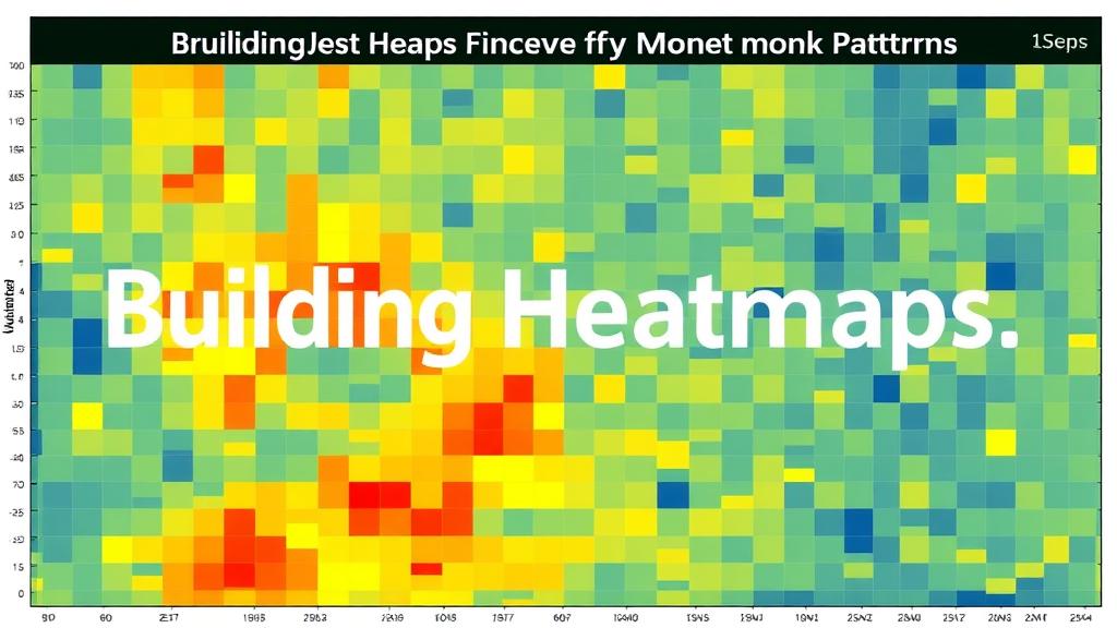
A heatmap is a data visualization technique that uses color to represent different values in a dataset. By encoding data in a two-dimensional format, heatmaps can transform overwhelming datasets into an easily digestible visual format. The intensity of color in a heatmap corresponds to the magnitude of the data point it represents, making it simple to see where the highest and lowest values lie.
Key Features of Heatmaps
- Color Gradient**: Different colors represent different values, often using a gradient scale from cool (low) to warm (high) colors.
- Data Density**: Heatmaps can effectively illustrate the density of data points, which is particularly useful in market analysis.
- Easy Interpretation**: Users can quickly identify trends, patterns, and anomalies without wading through complex datasets.
Steps to Build a Heatmap
Creating a heatmap involves several steps, from data collection to visualization. Below are the essential steps to guide you through the process.
1. Define Your Objective
Before you begin, clarify what you want to achieve with the heatmap. Some common objectives include:
- Identifying sales trends across different regions
- Analyzing customer behavior on a website
- Comparing performance metrics over time
2. Collect Data
Once you have a clear objective, the next step is data collection. Depending on your objective, you may need to gather data from various sources, including:
- Sales records
- Website analytics
- Market research surveys
- Social media insights
3. Data Processing
After collecting the data, it often requires cleaning and processing:
- Remove Duplicates**: Ensure there are no repeated entries.
- Handle Missing Values**: Fill in missing data or remove incomplete data points.
- Standardize Formats**: Ensure all data is in a consistent format for analysis.
4. Choose a Heatmap Tool
Select a visualization tool that suits your needs. Popular options include:
- Excel**: Good for basic heatmaps and available to many users.
- Tableau**: Offers advanced analytics and interactivity.
- Python Libraries**: Libraries like Seaborn and Matplotlib can create sophisticated heatmaps for users comfortable with coding.
5. Create the Heatmap
Using your chosen tool, you can now create the heatmap:
- Input your processed data into the tool.
- Select the appropriate color palette.
- Adjust settings such as axis labels and data range to enhance readability.
6. Analyze and Interpret
With the heatmap created, it’s time to analyze:
- Look for patterns, trends, and anomalies.
- Identify areas of high and low activity.
- Compare different datasets if applicable.
Real-World Applications of Heatmaps
Heatmaps have vast applications across various industries, particularly in marketing, sales, and customer experience. Here are a few real-world examples:
1. E-commerce Analytics
Online retailers often use heatmaps to track user behavior on their websites. By analyzing where customers click, scroll, and spend the most time, businesses can optimize their website layout, improve user experience, and ultimately increase conversions.
2. Geospatial Analysis
Businesses with a geographical aspect, such as real estate or retail chains, can utilize heatmaps to visualize customer distribution and sales performance across different locations. This helps in identifying potential market opportunities and areas for expansion.
3. Financial Market Analysis
Traders and analysts use heatmaps to visualize stock performance over time. By coding stock prices with colors, traders can quickly assess which stocks are performing well and which are underperforming, assisting in making informed investment decisions.
4. Social Media Engagement
Social media platforms can analyze engagement through heatmaps that show when users are most active. This information can inform posting schedules and content strategy, maximizing reach and engagement.
5. Email Campaign Performance
Marketers can create heatmaps to visualize the performance of different email campaigns. By analyzing open rates and click-through rates across different segments, businesses can tailor future emails for better engagement.
Best Practices for Using Heatmaps
To get the most out of your heatmaps, consider the following best practices:
- Keep It Simple**: Avoid cluttering the heatmap with excessive data. Focus on key metrics that align with your objectives.
- Choose the Right Color Palette**: Use colors that are easy to distinguish and convey meaning effectively. For example, red for high values and blue for low.
- Provide Context**: Always accompany heatmaps with additional information or insights to help stakeholders understand the data.
- Iterate and Improve**: Regularly update your heatmaps with new data and insights. This helps in keeping your analysis relevant and actionable.
Conclusion
Heatmaps are a versatile and powerful tool for identifying market patterns and trends. By breaking down complex datasets into visually digestible formats, businesses can make informed decisions that drive growth and success. Whether you’re analyzing customer behavior, market dynamics, or financial performance, the insights gained from heatmaps can provide a competitive edge.
As you embark on your journey to create effective heatmaps, remember to focus on clarity, simplicity, and relevance. With practice, you’ll find that heatmaps not only enhance your data visualization capabilities but also empower you to make smarter, data-driven decisions in your market strategies.


